

Teen Teams Programs: Brand Identity & Visual System
A bright, structured identity built for an adolescent education programme.
Overview
Teen Teams Programs empowers teens through emotional education and structured learning modules. They needed a clear, engaging identity that could support both printed workbooks and a full website experience.
I designed the entire identity system: colour palette, character and icon style, layout grids, digital UI language and editorial structure across books, worksheets and the full website.
The Challenge
TTP content is complex, covering emotional development, mental health, relationships and behaviour. The brand needed
to be:
trustworthy for parents
accessible for teens
structured for educators
expressive without becoming childish
bright without losing clarity
And above all: consistent across 200+ pages of material.


The Solution
Colour System
A bright, modern palette was created to distinguish modules, support reading flow and give the brand optimism.
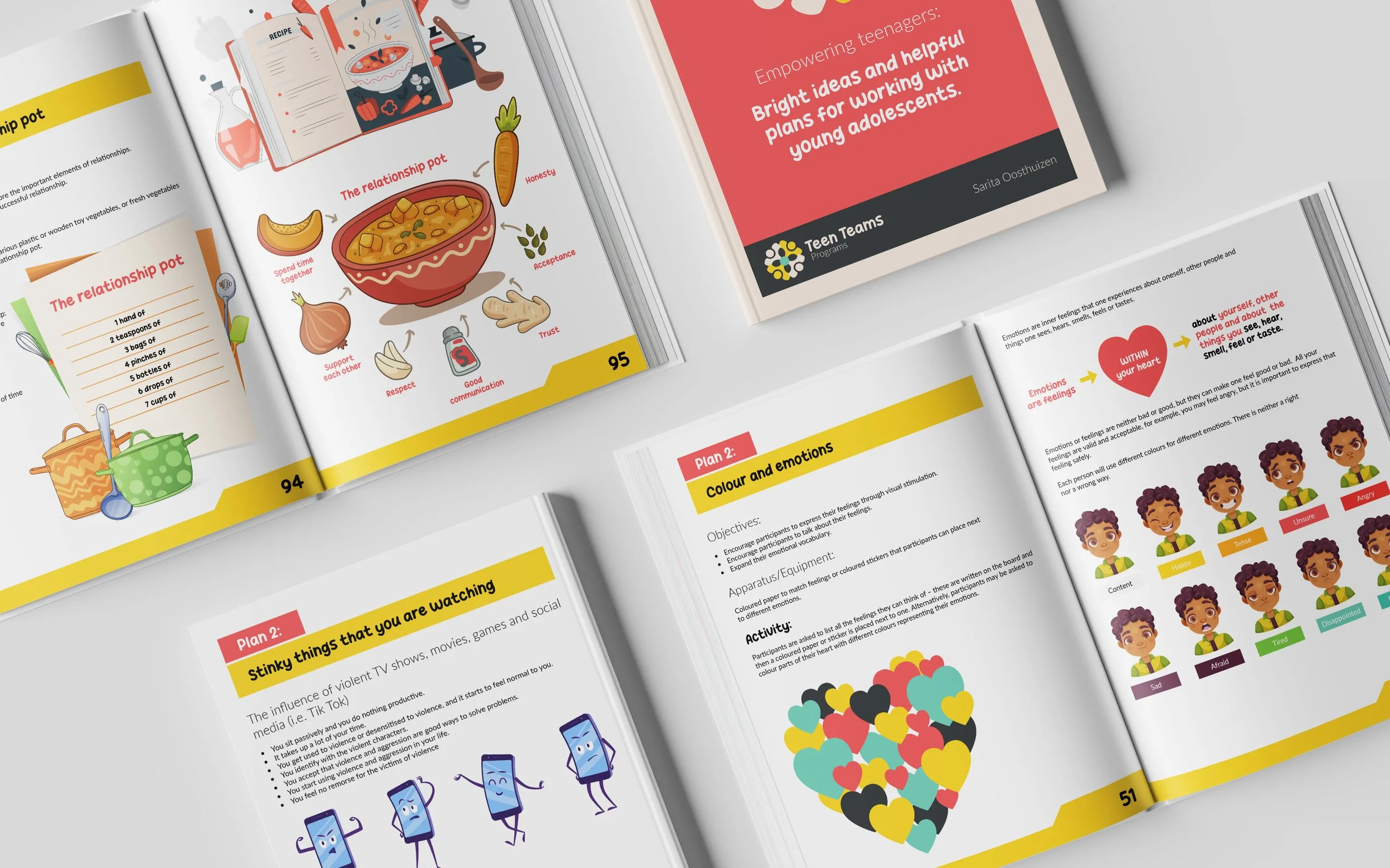
Illustration & Iconography
I developed a character style that’s friendly, expressive and grounded in behavioural cues — light enough for teens, clear enough for teachers.
Layout & Editorial System
Books and worksheets use a strict hierarchy:
bold headline bands
consistent margin system
module colour coding
intuitive reading order
plenty of white space for breathing room
Digital Activation
The website extends the visual language with:
simplified navigation
colour-coded sections
clean module cards
structured content blocks
Rollout
The identity spans:
full website
flagship programme book
individual plan modules
teacher materials
student worksheets
digital assets
Results
The identity sharpened TTP’s credibility, made learning materials easier to navigate, and strengthened the emotional clarity of the content. It’s now used across schools, training and online programmes.
Let’s Work Together
If you’d like to collaborate, discuss a project or explore a role, I’d love to hear from you.