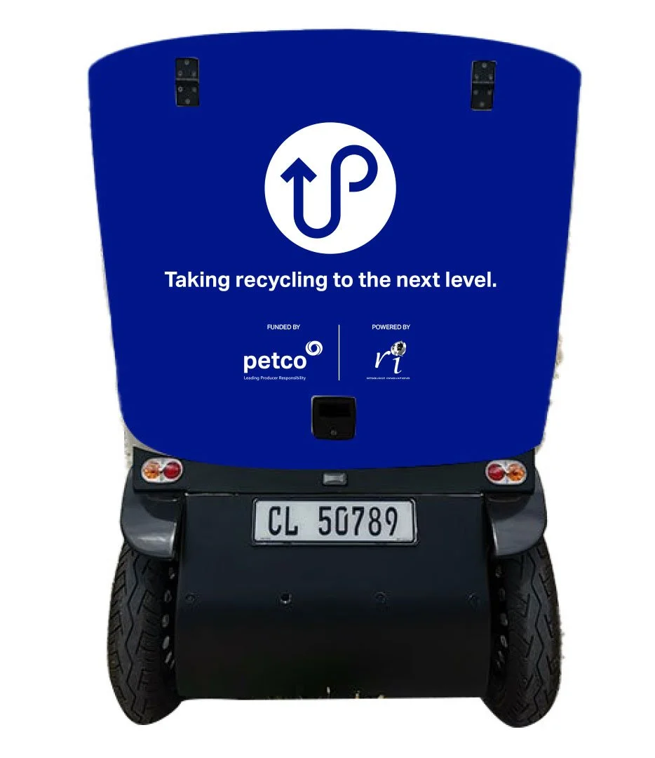
EV Branding: Mobile Vehicle Identity
Client: Petco | Role: Art direction, Design system, Colour & messaging
Overview
PETCO partnered with a local municipality to deploy a fully electric collection vehicle. The EV needed more than a wrap, it needed a bold, public-facing identity that could communicate recycling behaviour quickly, clearly and at street level.
My role was to create a visual system that turned a single vehicle into a moving billboard for separation-at-source, with enough clarity and confidence to educate while on the road.
The Challenge
Recycling messages are often muted, cluttered or visually inconsistent. The EV had to cut through suburban noise, read instantly at a distance, and feel modern enough to challenge the usual “green and brown” recycling aesthetic.
It also had to carry one message in a way residents could understand in three seconds:
Separate recyclable packaging from waste.
The Idea
Treat the EV like a moving billboard, something that works at 5 metres or 50.
The concept centred on:
Bold colour blocking designed for motion visibility
Simple, direct messaging with no competing information
Iconography and layout that wrap naturally around the vehicle form
A system that could scale to future EVs or other municipal assets if required
The vehicle becomes a daily reminder that recycling isn’t abstract, it’s immediate, practical and visible.
The Execution
I developed a full wrap system using high-contrast magenta and clean white space to give the EV a modern, disruptive presence on the road.
Elements included:
Side and rear panel layouts
Scalable iconography
Message hierarchy
Brand-aligned colour system
Production-ready wrap files
A template for future vehicles
The design maintains clarity from every angle and reads instantly while the vehicle is in motion or stopped at a collection point.
Results & Impact
The wrapped EV is now in daily municipal use, giving PETCO a consistent on-the-ground presence during collections, school visits and community outreach.
Field teams reported:
Stronger recognition of PETCO along regular routes
Clearer public understanding of “what goes where” at kerbside pickups
The EV becoming a visible anchor for PETCO’s broader education work in the area
With an estimated 4,000–6,000 daily impressions, the vehicle now operates as a reliable, high-frequency public touchpoint within the municipality
Let’s Work Together
If you’d like to collaborate, discuss a project or explore a role, I’d love to hear from you.


