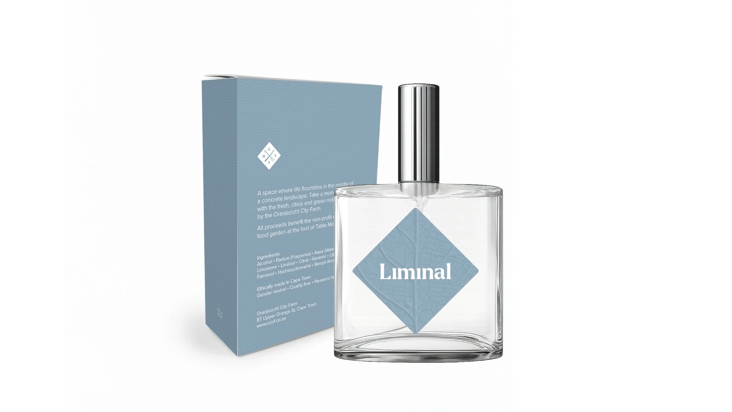
Liminal
A concept-driven fragrance and brand system for Oranjezicht City Farm
Overview
Liminal is a conceptual fragrance created for Oranjezicht City Farm.
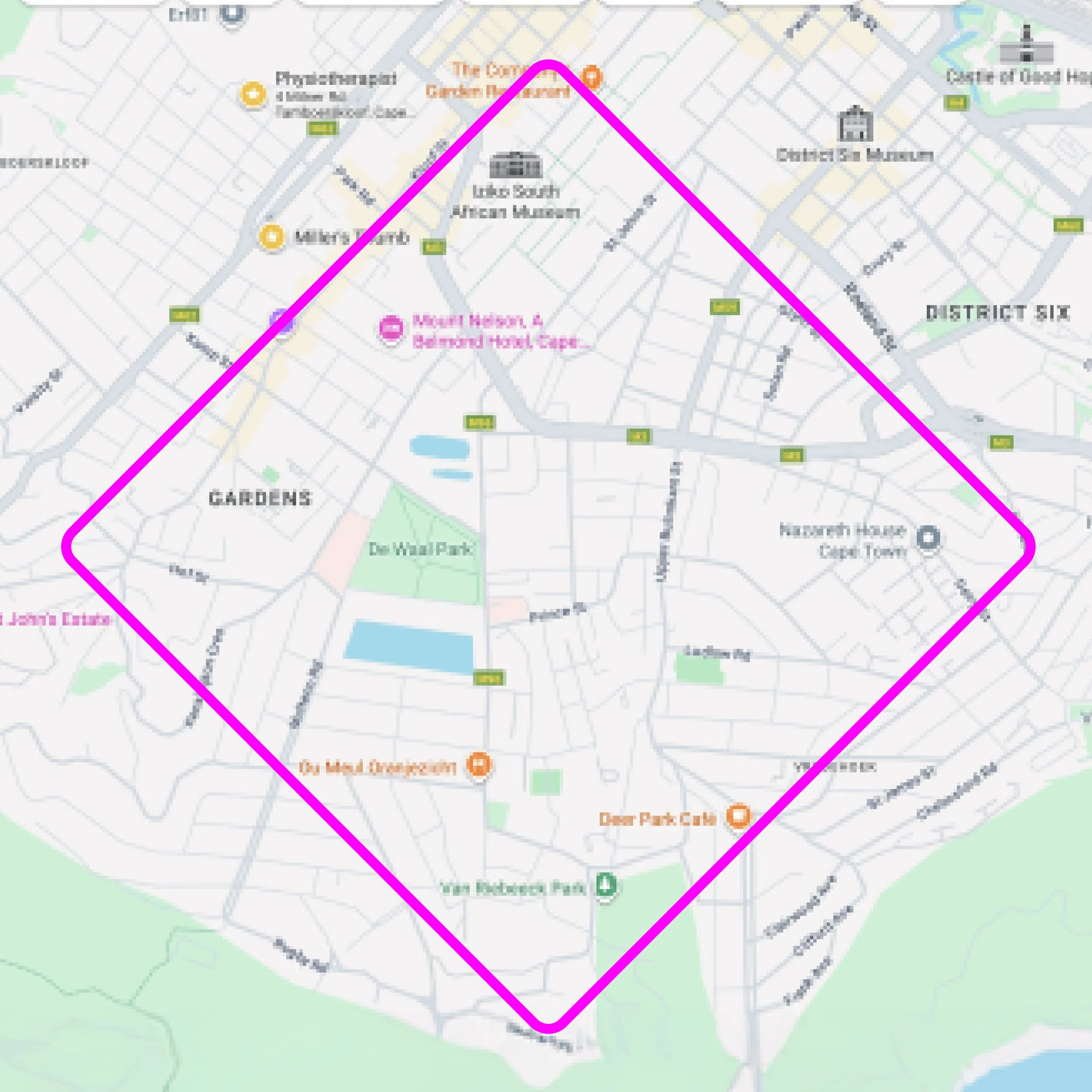
The project explored the idea of existing between worlds: city and nature, structure and growth, concrete and soil. Inspired by the farm’s position at the edge of Cape Town’s urban grid and the foot of Table Mountain, the fragrance became a sensory expression of transition.
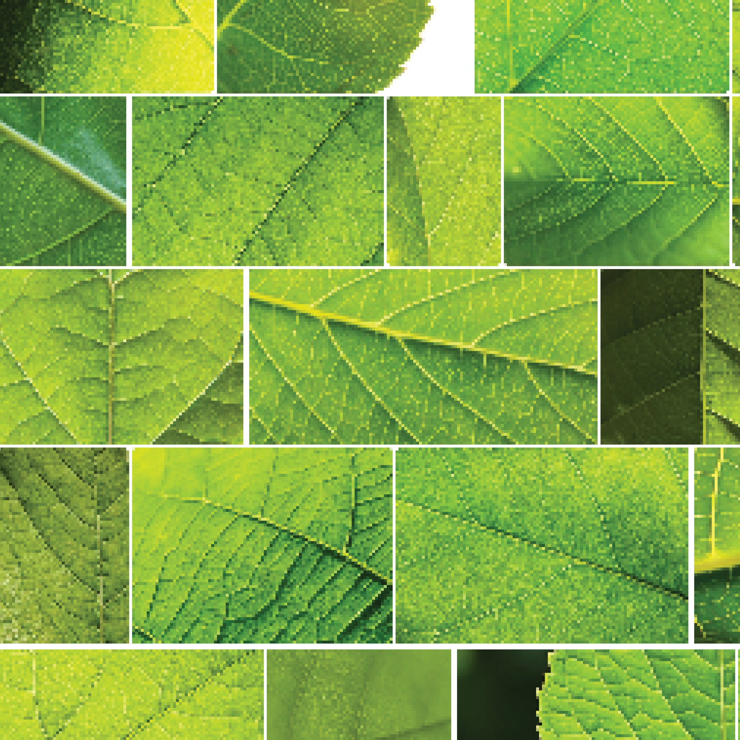
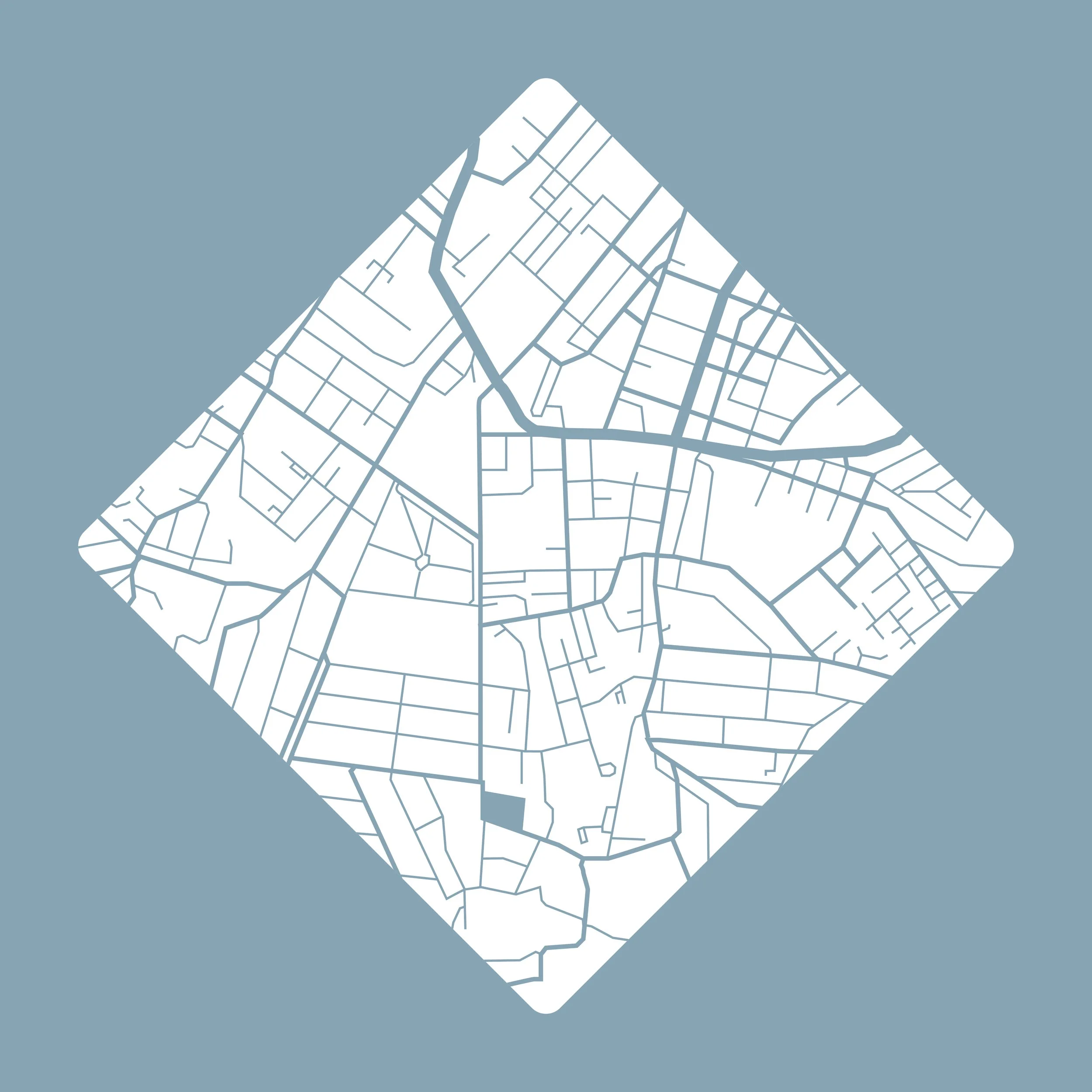
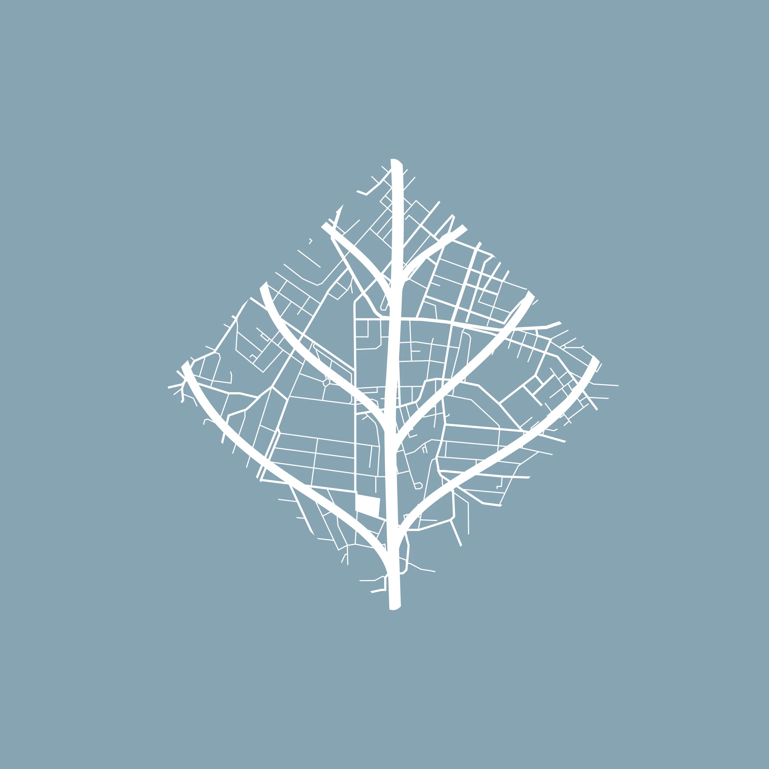
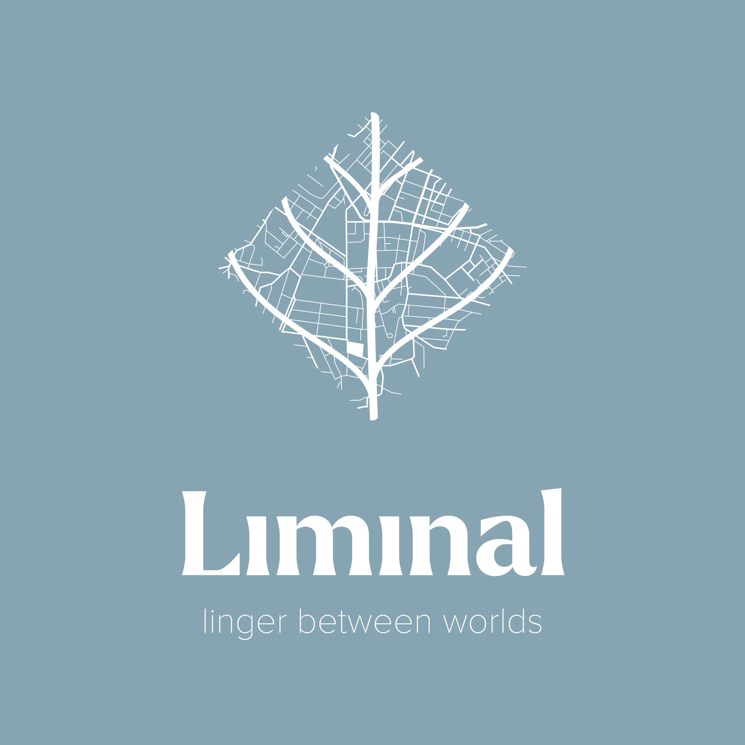
The identity system combined the geometry of the city map with the organic structure of a leaf, creating a brand world rooted in place, symbolism and material contrast.
The Challenge
Oranjezicht City Farm is a non-profit urban farm positioned within a dense metropolitan environment. The opportunity was to create a product that could generate funding while authentically representing the farm’s role within the city.
The challenge was to avoid generic “natural” branding. This could not feel like another botanical perfume. It needed conceptual weight, visual distinction and a clear link to place.
The fragrance had to embody tension: urban and organic, structured and soft, local and aspirational.
Strategy
The strategy centred on one core idea: liminality.
A space between.
A moment of pause.
A threshold.
We translated this through:
A hybrid visual language combining city grid lines with leaf veins
A diamond format symbolising rotation and transition
A restrained, elevated colour palette drawn from Cape Town’s landscape
A tactile packaging approach balancing softness and structure
Minimal, poetic copy reinforcing the idea of existing between worlds
The goal was to build a concept-first identity that could extend beyond a single product into a scalable brand system.
Execution
I led the project from concept development through visual identity and packaging design.
The execution included:
Concept development and naming
Creation of the Liminal wordmark
Development of a hybrid leaf-city symbol
Construction of a modular map-based graphic system
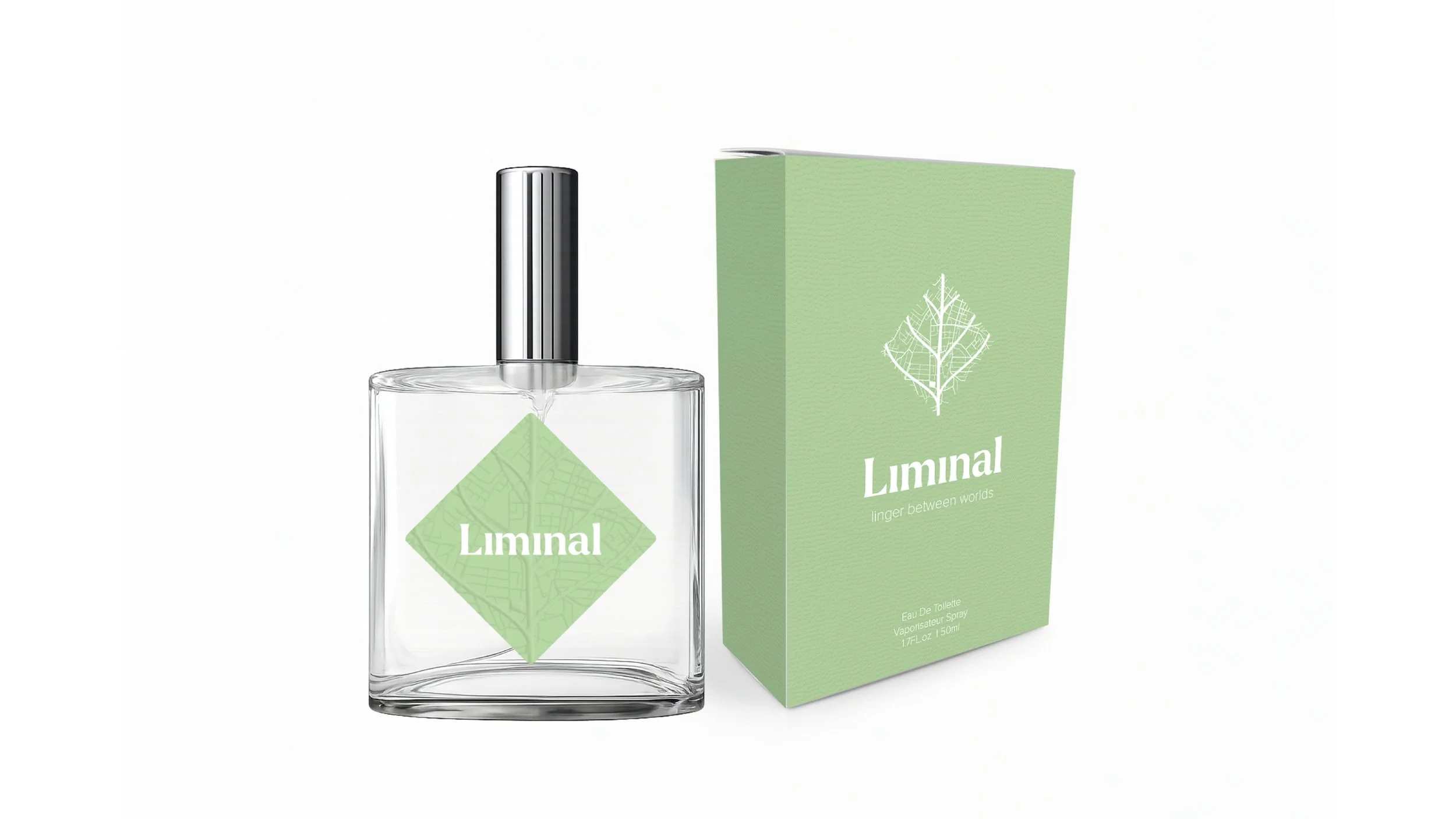
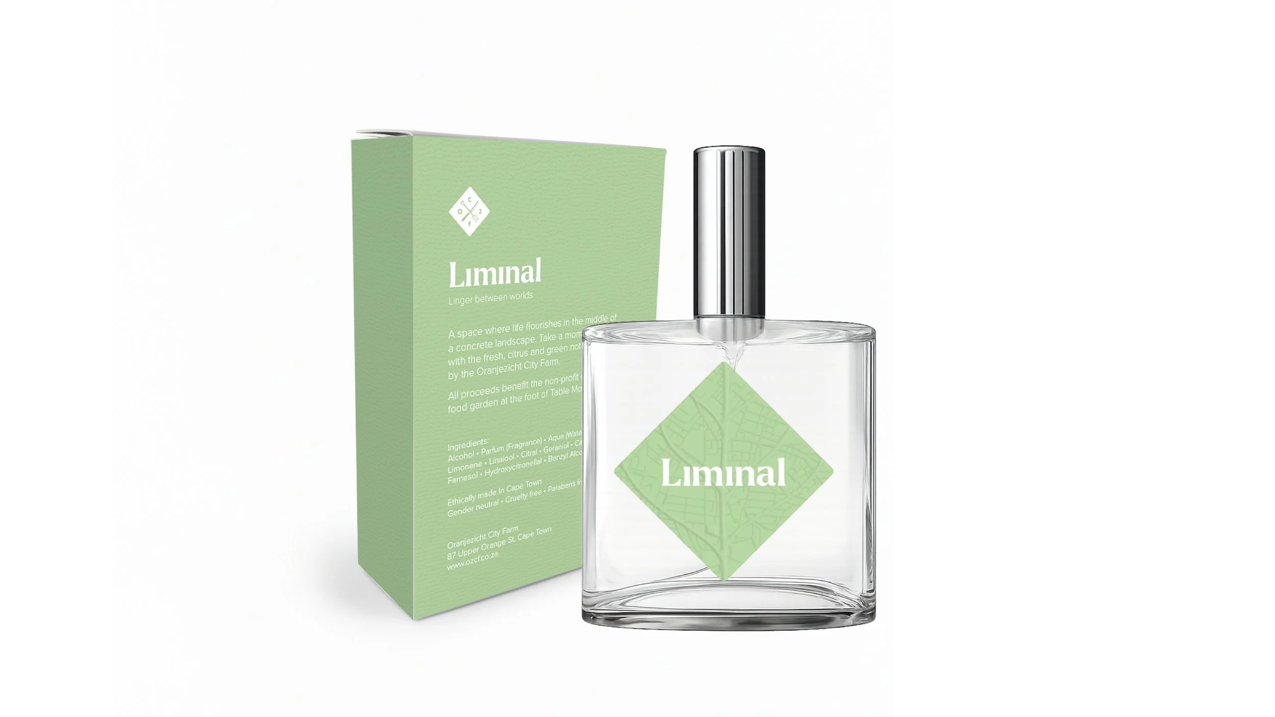
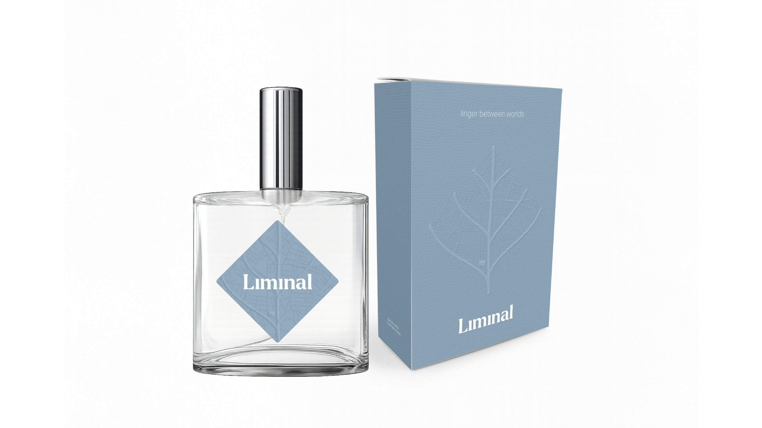
Packaging design across multiple colourways
Bottle label and emboss treatment exploration
Art direction of 3D mockups and presentation visuals
The leaf icon merges Cape Town’s street grid with a botanical structure, reinforcing the farm’s physical position within the city.
The diamond shape acts as both a visual anchor and a symbolic threshold. It rotates the city, reframes perspective and signals transition.
Two primary colourways were explored:
Green, representing growth and vitality.
Blue, representing atmosphere, distance and reflection.
The final packaging system balances softness through texture with architectural precision through layout and form.
Results & Impact
Liminal demonstrates how a non-profit product can move beyond functional fundraising into brand storytelling.
The project establishes:
A distinctive, ownable visual system
A scalable packaging language
A strong conceptual foundation
A premium positioning aligned with contemporary fragrance brands
The work elevates the perception of an urban farm from local initiative to cultural brand.
By grounding the identity in place and symbolism rather than decoration, Liminal positions Oranjezicht City Farm as both rooted and progressive.
It shows how thoughtful design can translate geography, purpose and philosophy into something tangible and desirable.

